APHA 2019 Convention
Client
American Public Health Association
Brief
Create a cohesive set of marketing materials to promote the upcoming annual public health convention.
Deliverables
- Logo
- Prospectus
- Postcard
- Ads
- Promo Booklet
- Program Guide
- Email Banners
Logo
When working with APHA, we start the process of creating the convention materials with a kickoff meeting to go over the production timeline and learn more about the theme, host city, and ask about how the previous year’s materials were received by the attendees.
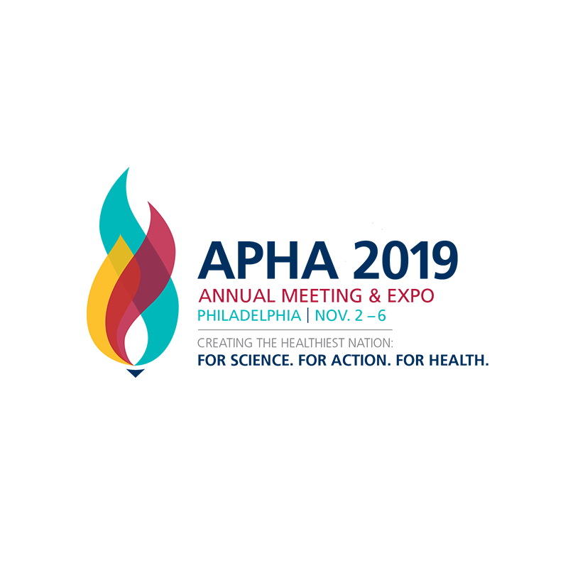
The convention theme for this year was “For Science. For Action. For Health.” After reading the theme summary and discussing it with our client, we immediately started brainstorming and sketching. Our team presented a few logo options and eventually “the torch” was chosen for the impact of the design and the bold representation of what the torch symbolizes. During the design process we found that it could symbolize three main ideas — life, truth, and regeneration — which mimicked the three distinct parts of the theme. The three flames within the base of the torch also reflect the three statements in the theme: “science, action, and health”.
We were also able to associate the meaning of fire with this year’s theme. Fire is never stagnant, which worked with the idea of action — that action and motion can propel society forward to make change. That change can be passed from person to person, and generation to generation, like the passing of a torch.
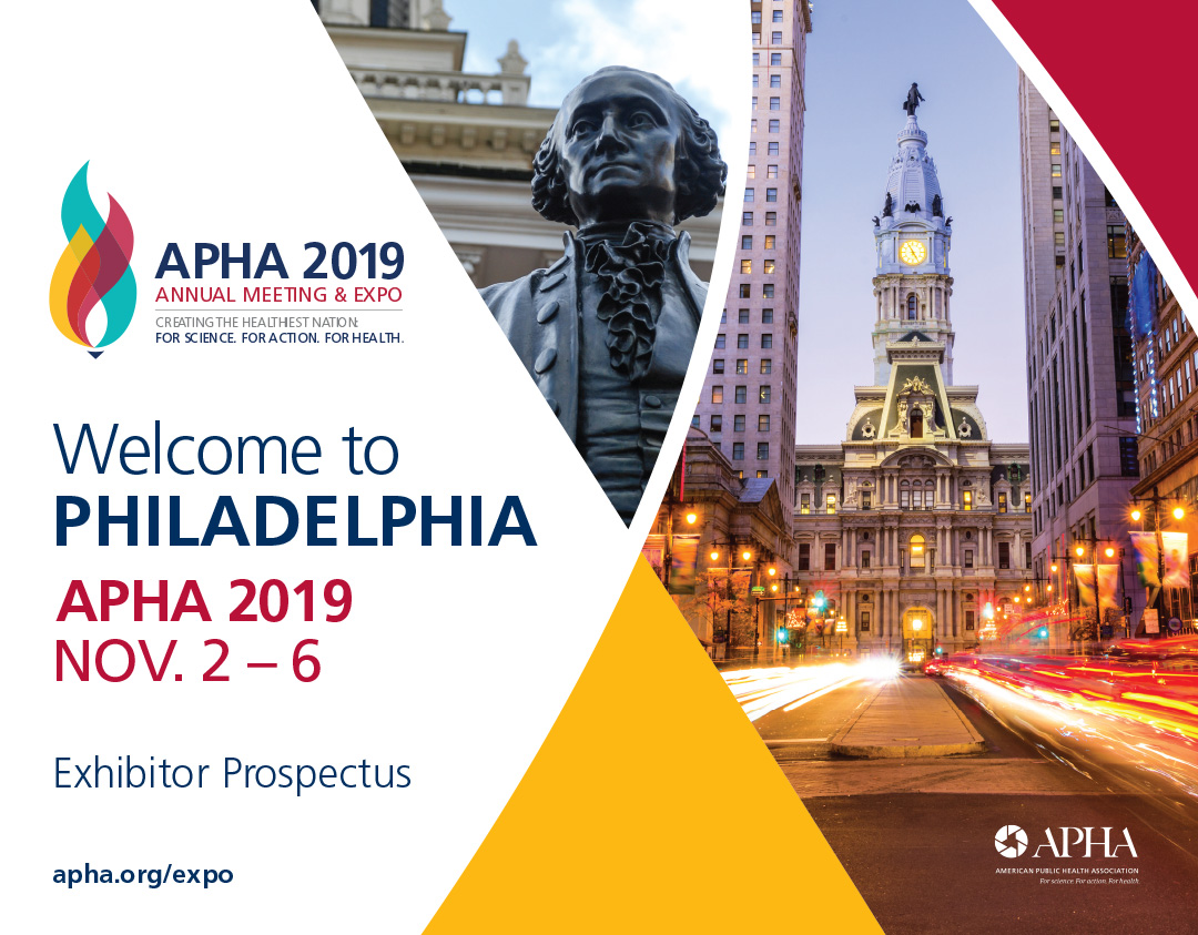
Prospectus and Promos
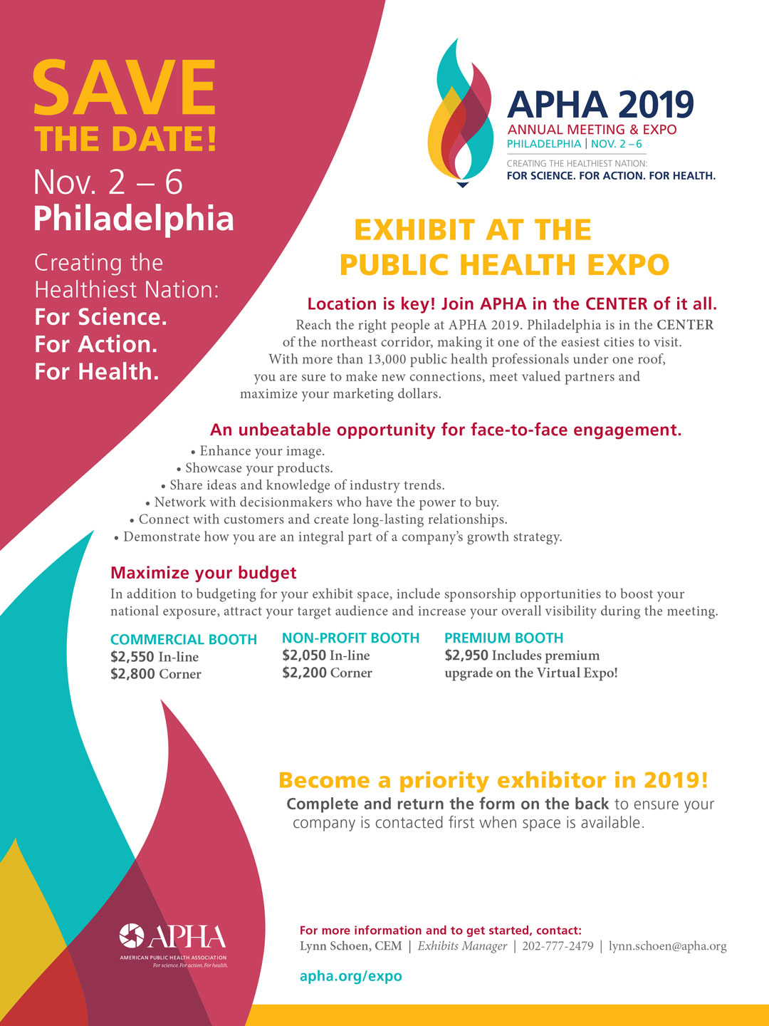
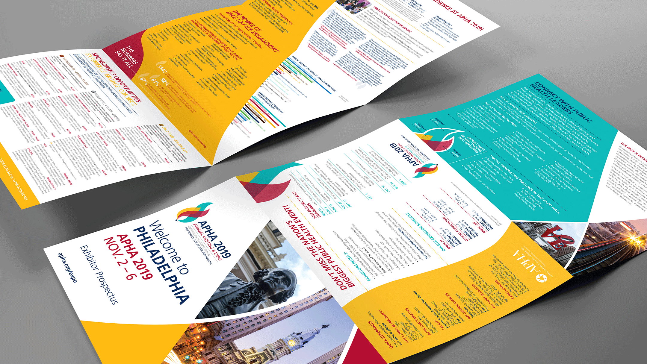
After the logo has been created, the main piece that sets the tone for the convention is the prospectus. This is one of the first pieces to be mailed out to let exhibitors and attendees know what to expect and what they need to do to exhibit. This 12″ x 27″ (folded to 12″ x 9″) trifold highlights key information, statistics, and pricing. When thinking about the design, the information we receive is broken down into six sections, one section for each panel of the trifold. We then begin applying the design elements based on the newly created logo. Since this is a very text heavy piece, we make sure to keep a good balance of text, imagery, and negative space.
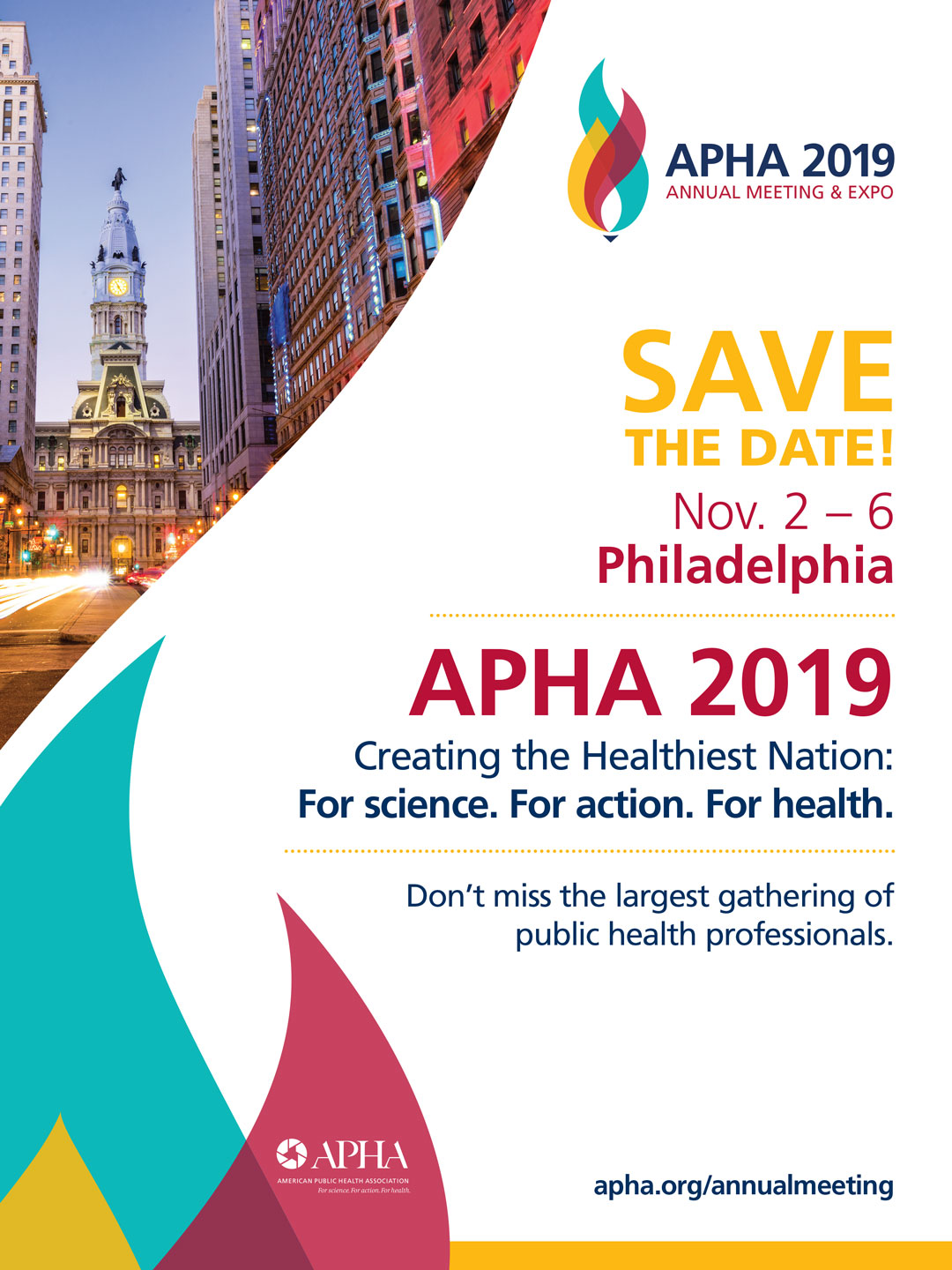
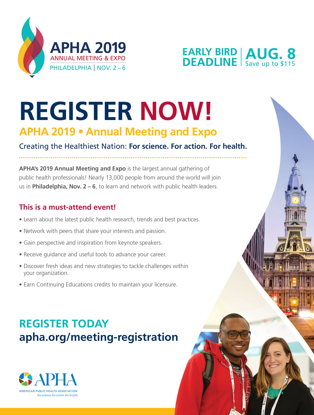
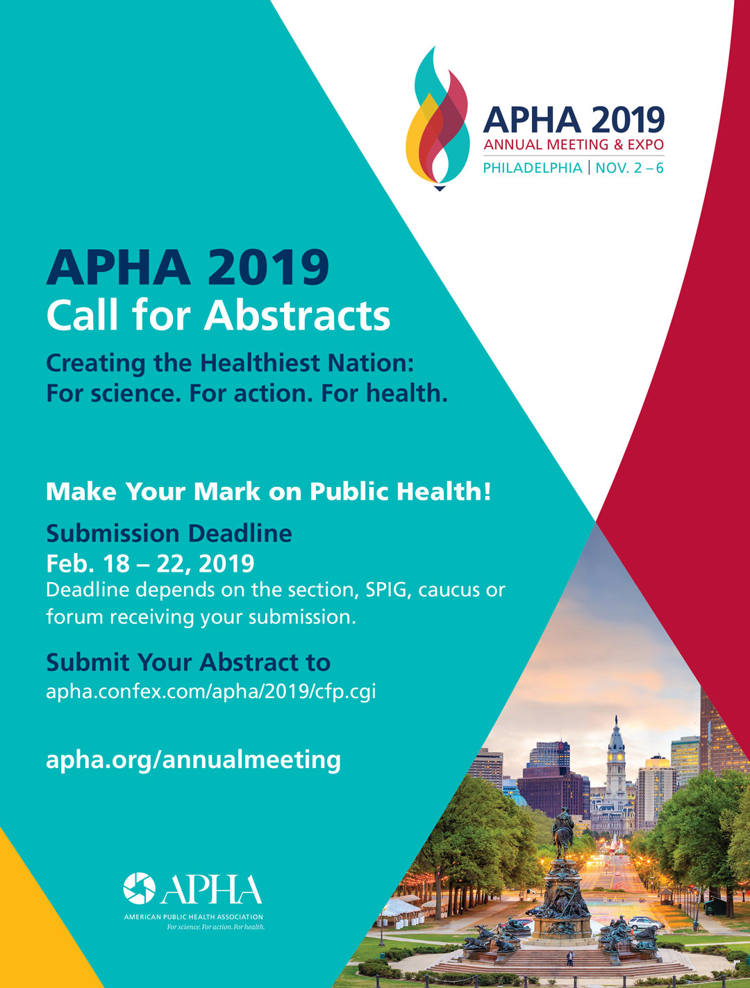
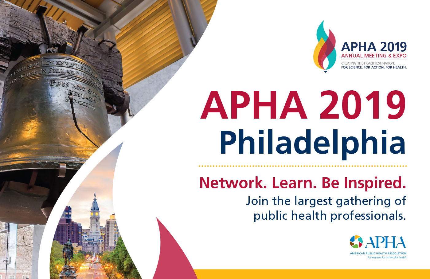
We were also tasked with creating banners, ads, and postcards that were used to help promote the event. Email banners were created in multiple sizes and variations based on the timeline leading up to the convention. We created flyers and ads that were used as save-the-dates, submission reminders, and general information pieces. The marketing postcard was also created to promote the convention and act as a gauge for interest in the event.
Program Guide
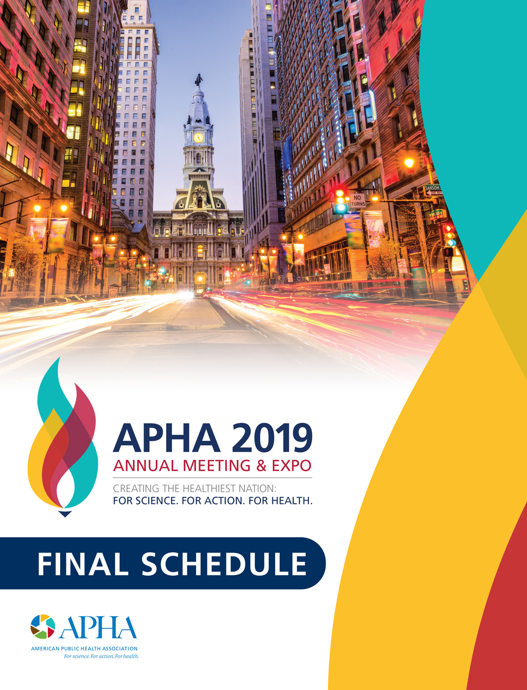
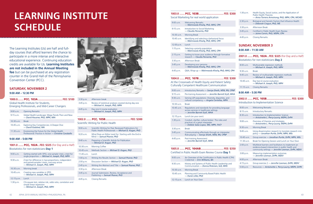
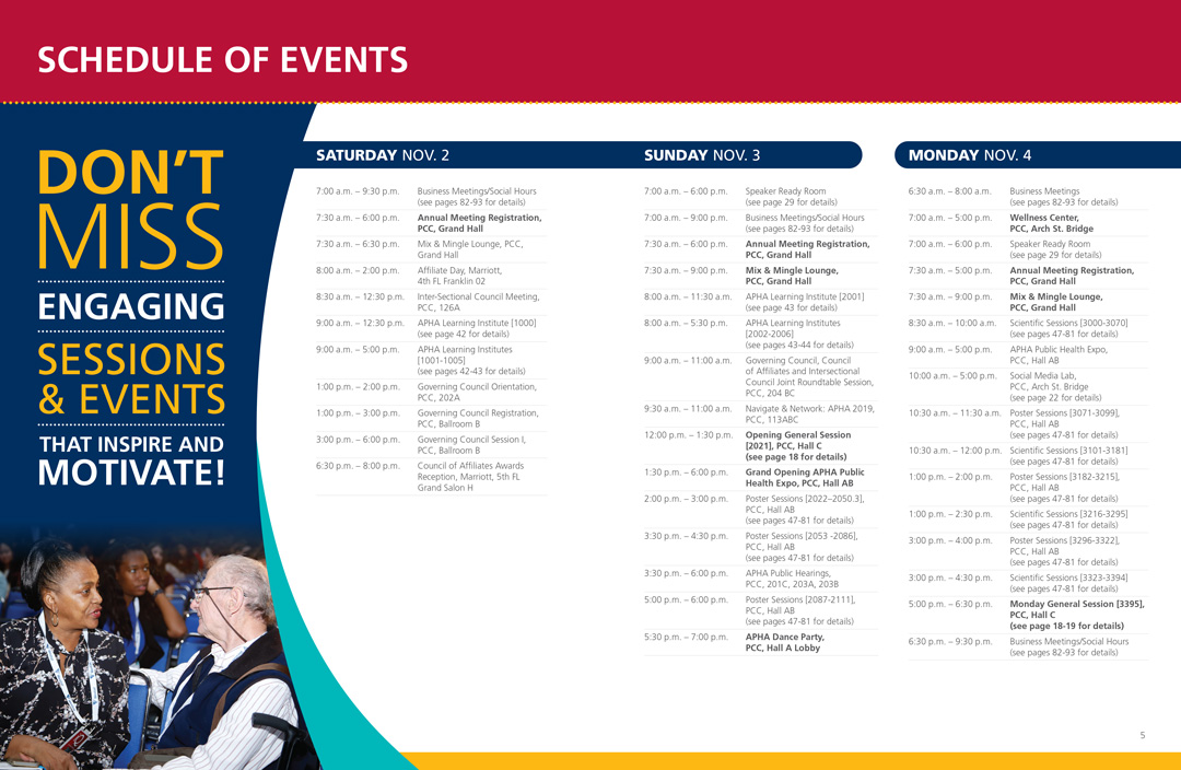
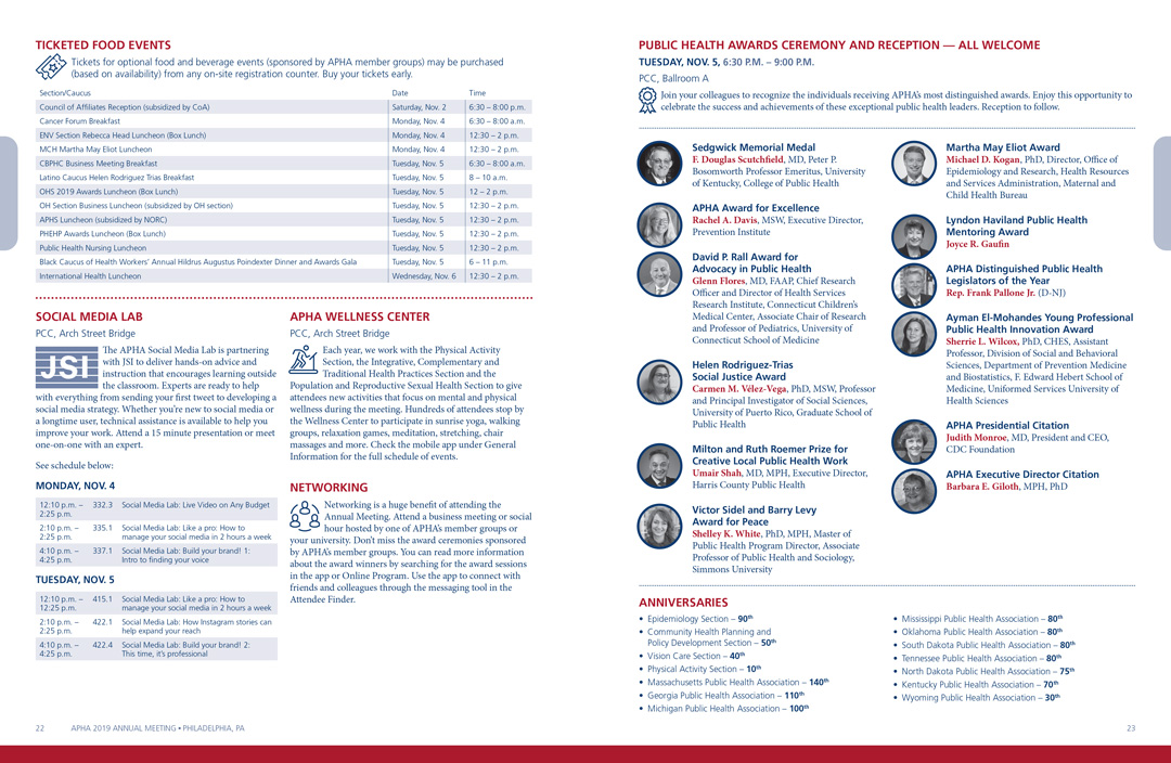
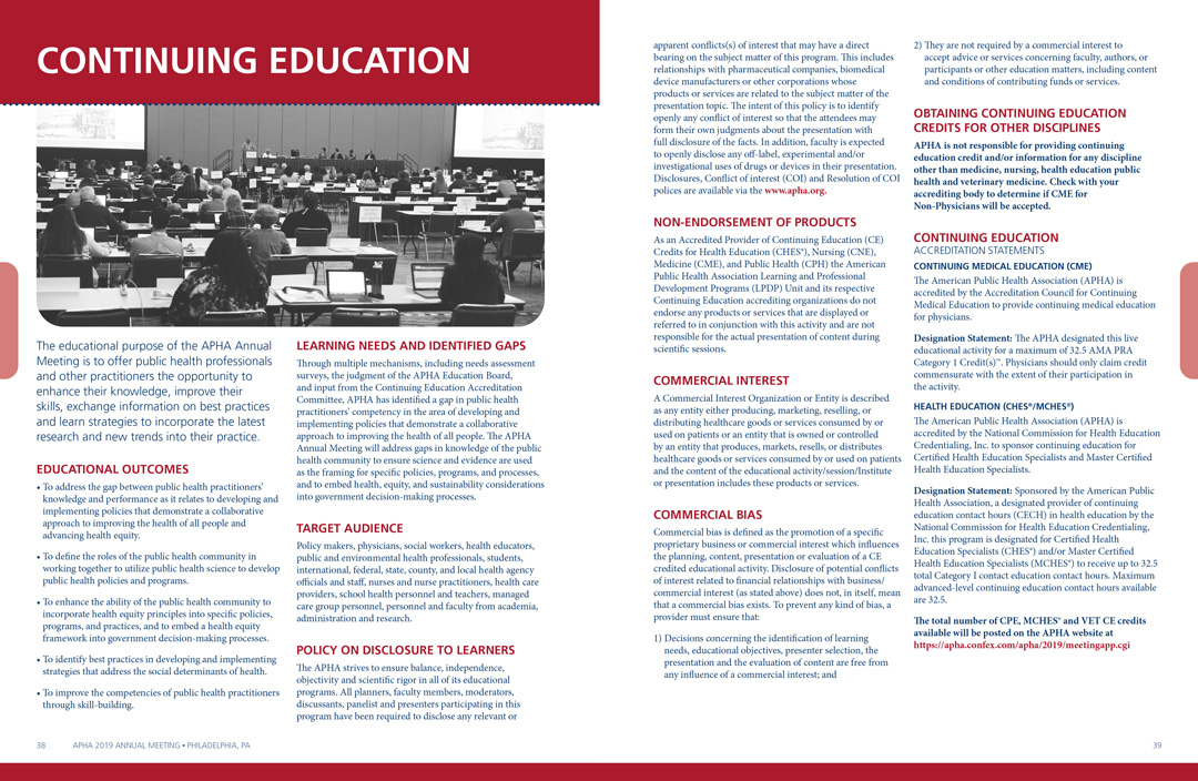
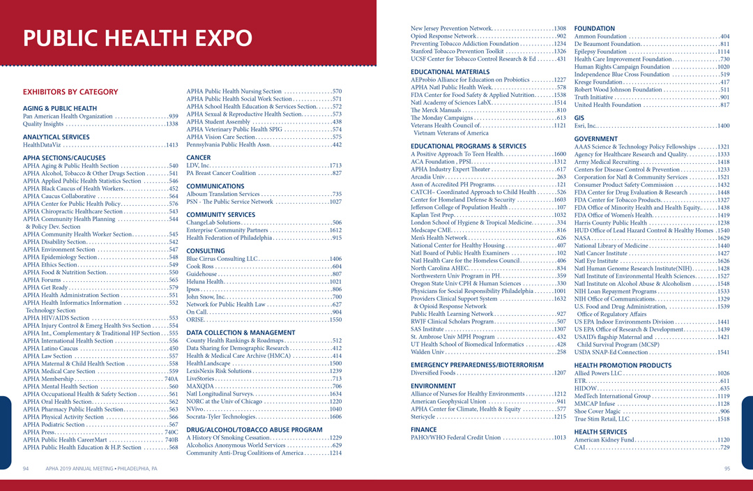
The largest and most time-consuming piece that is created is the program guide. The guide contains everything that attendees will need during their time at the convention, like schedules, session information, floor plans and more. The guide needed to be split into a few different sections that we differentiated by color. This was done by having a full color intro and a 2-color main section that used color markers for subsections. A majority of the guide consists of information that is displayed in tables for ease and clarity.
Highlights Booklet
The highlights promo booklet, like the other pieces, is used to promote the upcoming convention. Like the name says, it highlights key aspects of what attendees can expect and gets them excited and informed about what is to come. Although it is only twelve pages, it concisely displays the most essential information while maintaining the look and feel of the branding we set. We were also able to incorporate more imagery, like photos and infographics, into this piece to entice attendees.
